
ZONA MACO 2026: Artists of Note
Notes from Mexico City on material and the future of form
ZONA MACO is often described as the leading contemporary art fair in Latin America. That's true. It was founded in 2002 by Zélika García and has grown into a major international platform pulling blue-chip galleries, ambitious young programs, collectors, curators, and institutions into one room.
But calling it "a fair" feels reductive.
This is a market, yes. It's where works are placed, collections are built, and numbers are quietly negotiated.
What It Actually Is
ZONA MACO is:
- A commercial marketplace (galleries present works for sale)
- A cultural meeting point for Latin American and global art scenes
- A temperature check on where contemporary art in the region is headed
It typically includes multiple sections: Contemporary Art, Emerging / New Proposals, Modern Art, Design, Photography.
It's held at Centro Citibanamex and anchors what many consider Mexico City Art Week, alongside satellite fairs, gallery openings, and museum events.
Why It Matters
From a market perspective: It's one of the strongest platforms for Latin American artists gaining global visibility. International galleries increasingly use it to reach collectors who may not travel to Basel or Frieze. Major collectors from the U.S., Mexico, and South America attend with real acquisition intent.
From a cultural perspective: Mexico City has become one of the most dynamic art capitals in the Americas. The fair reflects regional identity without flattening it for export. There's a material confidence — fiber, pigment, stone, craft — that feels distinct from the hyper-polished feel of some European fairs.
As a Gallery Director thinking about institutional positioning and long-term collecting strategy, it's less about "what sold" and more about which conversations are accelerating.
And right now, Mexico City is very much in the middle of them.
In short: What I love about ZONA MACO is that it doesn't beg for validation from New York or Basel. It moves in its own rhythm. There's material confidence here. Texture. A comfort with symbolism. A refusal to flatten identity into trend.
Below are the works and artists that stayed with me — not because they were the biggest booths, but because they held something slower. Something that felt like it would last beyond the week.
Anne von Freyburg (K Contemporary)
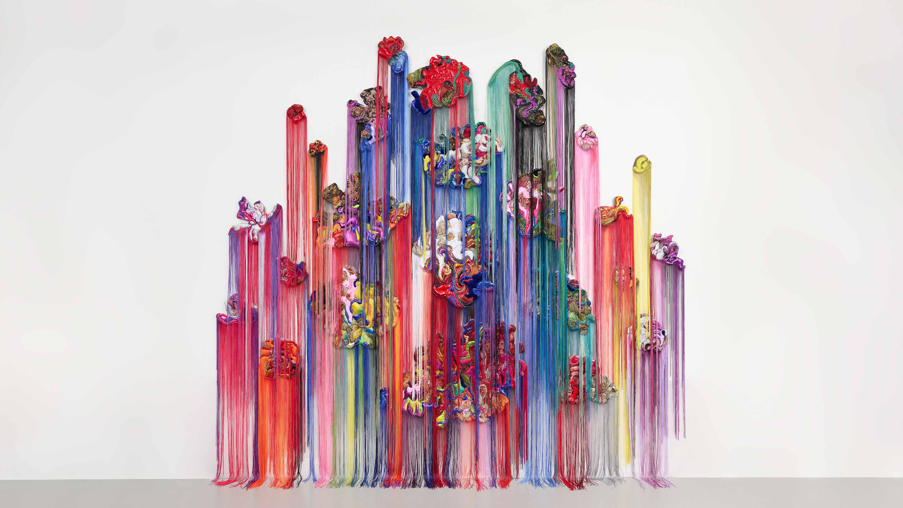
Electric Feel (After Fragonard, The Pursuit), 2025 Textile painting: acrylic ink, synthetic fabrics, PVC fabric, tapestry-fabric, sequin fabrics, hand-embroidery, polyester wadding and hand-dyed tassel fringes on canvas 138 × 106 in | 350.5 × 269.2 cm
Anne von Freyburg is a Dutch artist based in London. Her large-scale textile paintings are reconstructed Rococo portraits and florals made out of a mixture of tapestry and contemporary fashion fabrics. With imagery sourced from the French and Dutch 18th-century painters, François Boucher, Jean-Honoré Fragonard, and Jan van Huysum, her work addresses stylized and fetishized notions of feminine beauty.
Von Freyburg attempts to raise questions about taste, femininity, high and low art, and the constructs of female identity. The appropriated paintings are created with acrylic ink which is translated into hand-stitched fabrics and sewing techniques that give the work a quasi-bodily presence. On the one hand, von Freyburg's works are playful and reference the decorative quality of their sources; on the other, their over-indulgence points to the excesses of throwaway fashion culture, selfies, surgical interventions, and consumerism. By combining fine art with applied art in a conceptual way, she aims at blurring the boundaries between them. - K Contemporary
Textile continues to be one of the most intelligent conversations in contemporary art.
Von Freyburg collapses painting and sculpture into fiber. From across the aisle, the work reads as lush abstraction. Up close, it reveals devotion — hand-embroidery, sequins, fringe, surface built through labor.
The Fragonard reference matters. She isn't rejecting art history; she's reweaving it.
What stayed with me is scale. This isn't craft tucked politely on a wall. It's institutional in presence while still carrying the intimacy of touch. The hierarchy between "high art" and "domestic medium" continues to dissolve — and fiber is not asking for permission anymore.
Paula Turmina (Ambar Quijano)
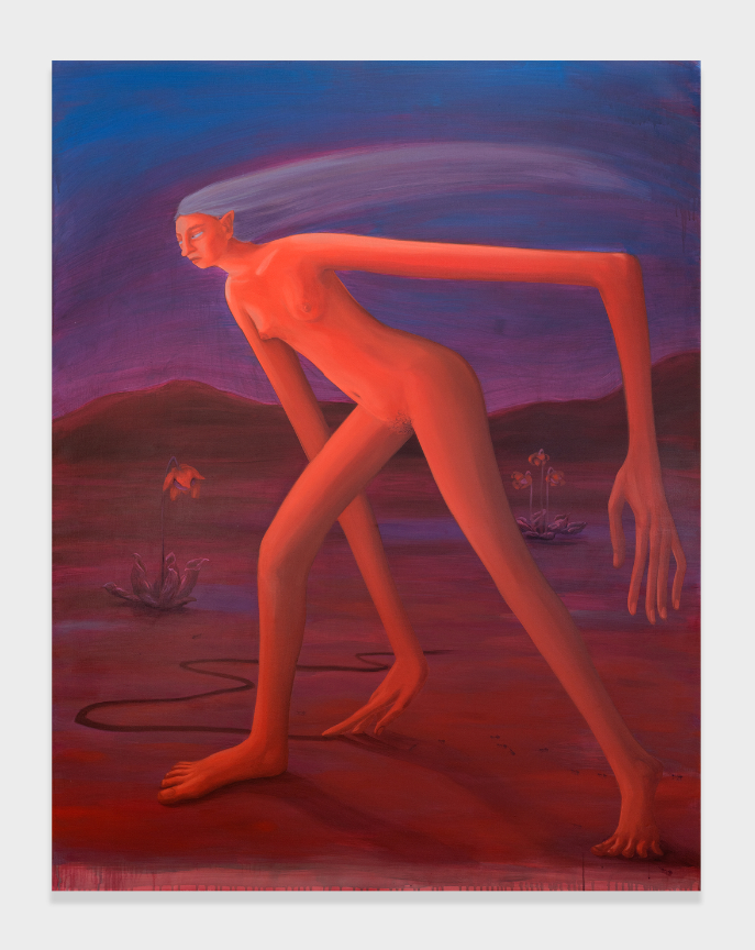
Silent attempts, 2024 Oil on linen 70 9/10 × 55 1/10 in | 180 × 140 cm
Paula Turmina (b. 1991, Brazil) is a multidisciplinary artist based in London, whose practice investigates the porous boundaries between bodies, matter, and the planetary environment. Drawing on soil ecologies, climate fiction, and cosmic perspectives, her work considers the Earth as a living entity, using painting as a method to explore the tension between bodily presence and geological time. -Ambar Quijano
The gallery describes Turmina's practice as investigating porous boundaries between bodies, matter, and the planetary environment — soil ecologies, geological time, climate fiction.
All of that is there.
But what I felt first was quiet.
Her spaces hold a kind of suspended breath. Figures appear as if emerging from atmosphere rather than occupying it. The scale invites confrontation, yet the emotional register is internal.
I'm always drawn to artists who understand silence. Who don't rush the viewer. Turmina's paintings don't perform urgency. They hum beneath it.
Jiří Hauschka (Arma Gallery)
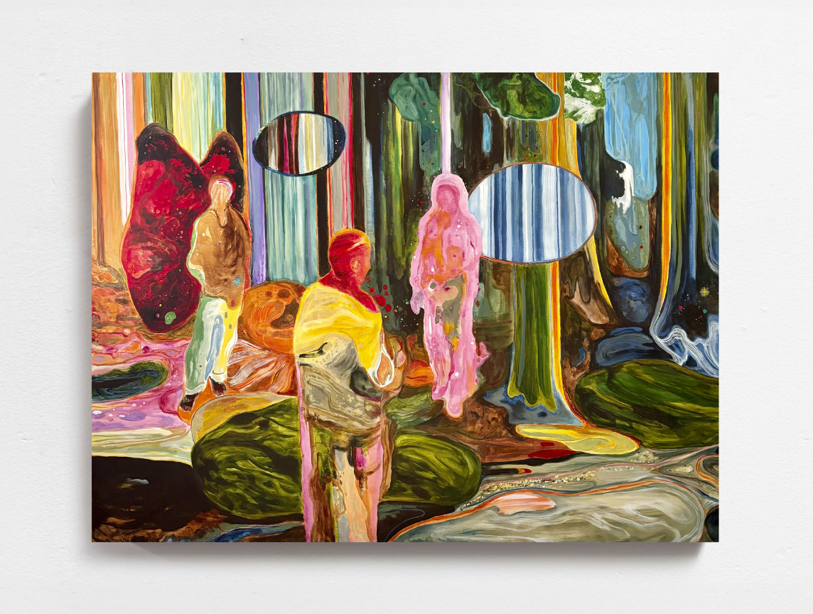
Autumn Town Leaves, 2026 Acrylic on canvas 59 1/10 × 78 7/10 in | 150 × 200 cm
A Czech artist and member of the Stuckists, an international art movement. Born in Šumperk, he now lives in Prague. He received education in classical arts. His work balances abstraction and figuration, and his pieces are represented in the National Gallery of Prague as well as many private collections.
In the beginning, his work was distinguished by an abstract style. His artistic development was significantly influenced by his stay in the UK in 2005, where he met Charles Thomson, the founder of Stuckism. At that point, Hauschka moved away from a strictly abstract style, focusing on details and his distinctive use of black line drawing, reminiscent of pencil sketches. After returning from the UK, he leaned towards a more realistic approach; his work balances abstraction and magical realism. The themes are inspired by the artist's experiences and perceptions (two worlds: the deep inner and the specific outer), which freely intertwine throughout his work.
His landscape paintings often reflect a fascination with the magic and mystique of the forest, featuring an almost somber atmosphere of forest mists. -Arma Gallery
Arma positions Hauschka within abstraction, figuration, and magical realism — shaped in part by his encounter with Stuckism in the UK and his return to Prague.
What I see is voltage.
Color isn't descriptive in these landscapes. It's emotional architecture. Forests dissolve into movement. Figures slip between worlds — inner and outer — without announcing the transition.
There is lineage here — European modernism, certainly — but the execution feels immediate. These are not nostalgic landscapes. They vibrate. They would shift the energy of a room instantly.
Lola Stong-Brett (Carl Freedman Gallery)
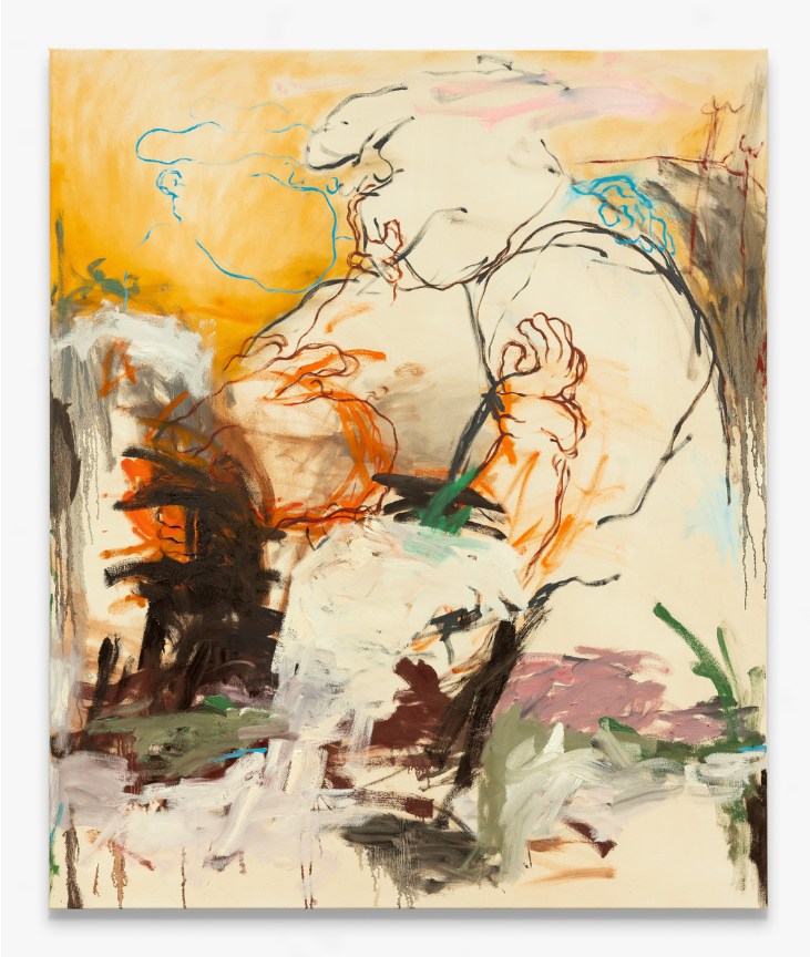
Sometime's It'll Be Ok, 2025 Oil on canvas 70 9/10 × 59 1/10 in
Lola Stong-Brett's paintings draw deeply from her immediate surroundings, memory, and nostalgia, functioning as intimate diary entries that contemplate the ebb and flow of everyday existence. Her work delves into the inherent contradictions of human nature, exploring the fluid boundaries between joy and despair, and drawing on both her personal mindset and the universal concepts of ascent and fall—heaven and hell—within her relationships and inner world.
The figures in Stong-Brett's work, initially reminiscent of animated characters like Popeye and Bimbo, evolve from playful familiarity into unsettling, often violent portrayals of ordinary life. Shaped in her upbringing within a community deeply invested in hard work and resilience, she was drawn to these characters for their depiction of working-class life, resonating with the authenticity of her own experiences. By intertwining abstraction with figuration and merging the cartoonish with the gravitas of oil painting, Stong-Brett collapses the divide between high and low art. Her use of facade-like masking overlays darker, more melancholic meanings, much like a public mask conceals private complexities. Over time, the figures become increasingly ambiguous, leaving the viewer uncertain whether they are embracing or strangling one another, symbolising the tension between connection and conflict.
Living by the sea in Margate, Stong-Brett finds a delicate balance between the comforts of domesticity and the uncontrollable forces of nature. This tension between the familiar and the chaotic pervades her work, as she juxtaposes the mundanities of everyday life—pool tables, pub scenes—with the raw, elemental presence of the sea. In her paintings, Stong-Brett also weaves in her personal interests, including tattooing, folk art, and her own poetry, adding layers of meaning that reflect both her artistic practice and her personal identity. - Carl Freedman Gallery
The gallery speaks to diary-like intimacy, contradictions of joy and despair, the merging of cartoon language with oil painting gravitas.
What struck me is the tension between tenderness and threat.
Her figures feel almost animated at first glance — playful, elastic — and then suddenly ambiguous. Are they holding each other? Strangling? Comforting? Containing?
I'm interested in artists who collapse high and low without irony. Who let tattoo culture, folk references, working-class iconography, and painterly seriousness occupy the same canvas without hierarchy.
There's emotional honesty here. And a refusal to tidy it up.
Horacio Quiroz (YUSTO/GINER)
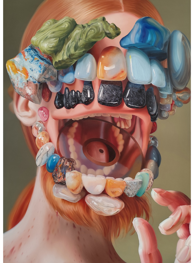
A pearl as a side effect of injury, 2026 Oil on canvas 78 7/10 × 55 1/10 in | 200 × 140 cm
Born in 1981 in Mexico City, Horacio Quiroz is a self-taught artist whose work delves into the complexities of the human condition, focusing on themes of gender, identity, and the body's relationship with its environment. After earning a degree in graphic design from Universidad Iberoamericana, Quiroz spent over a decade as an art director in advertising before transitioning to a full-time art practice in 2013. His paintings are characterized by rich depictions of the human form, exploring hybrid states that blend the beautiful with the grotesque, and the familiar with the unknown. Through his art, Quiroz invites viewers to engage with the dynamic interplay of opposing forces, prompting reflection on personal and collective identities. - Duran Contemporain
And then — the gem skull (my reductive way of remembering this piece that became the mouthpiece for ZONA MACO on social media, from my viewpoint)
Quiroz works in miraculously juicy and palpable oils, transforming familiar Greco-Roman allegory and symbolism into a contemporary conversation.
His paintings are plays on built systems of value— precious materials, hard-won architectural feats, long-lived mythological references to Aphrodite, Apollo, Athena, and beyond.
They're simultaneously devotional, anthropological, and confusing.
In another context, they could feel theatrical. Here, they felt grounded.
By far the most visually arresting work of the fair, in my opinion.
Why ZONA MACO Matters
Fairs can sometimes feel like temperature checks on the market.
This felt different.
What we see from exhibitors in Mexico City was a confidence in material — in fiber, pigment, stone, and narrative. A resistance to homogeneity. A reminder that contemporary art doesn't move in one direction; it moves in constellations.
If you're building a collection that wants depth — not just trend alignment — these are the kinds of voices worth tracking early.
Some serious. Some whimsical. Some cerebral. Some devotional.
If I had the wall space (and the shipping logistics solved), at least one of these would already be en route home.
