
Four Letters and a Lifetime
How Robert Indiana turned four letters into a timeless symbol of modern design, emotion, and everyday culture
Some images do not just belong to art history. They belong to memory.
They slip quietly into our daily lives and, over time, become so familiar that we forget someone once had to imagine them into existence.
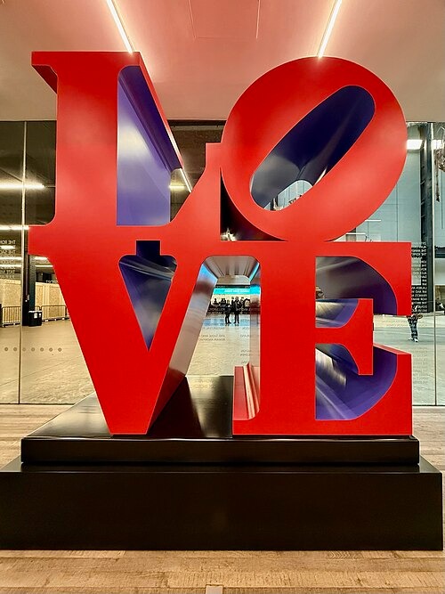
LOVE is one of those images.
Before it became a sculpture tourists line up to photograph. Before it appeared on postage stamps, pop-up cards, and museum merchandise. Before it turned into a universal symbol of affection and optimism. It began as a graphic experiment — a meditation on how a single word could hold emotional weight.
Created by Robert Indiana, LOVE remains one of the rare works of modern art that feels just as relevant now as it did more than fifty years ago.
The American Painter of Signs
Indiana often referred to himself as the "American Painter of Signs." It was not a throwaway phrase. He understood the power of language in public space — how words shape belief, identity, and memory.
Working within the Pop Art movement of the 1960s, Indiana carved out a distinct lane. While many of his contemporaries leaned into irony and consumer critique, he leaned into clarity, boldness, and sincerity.
His exploration of text and image also referenced the graphic language of highway signage that punctuated the Midwestern landscape where he grew up, along with the mass media culture blossoming as the artist came of age in the 1950s.
He was one of the earliest artists to center language as image — a move that would echo through generations of conceptual and text-based artists who followed.
LOVE IS GOD
The origin of LOVE is deeply personal.
As a child, Indiana was raised within the Christian Science church. Its interiors were spare, almost austere, with one consistent decorative element: a gold inscription reading God Is Love.
That phrase lodged itself in his memory.
Years later, when collector Larry Aldrich converted an abandoned Christian Science church into what would become The Aldrich Contemporary Art Museum, Indiana proposed a reversal of that inscription: Love Is God.
He later wrote that the LOVE paintings "sprang like a crop from that seed planted at your museum." The phrase was not ironic. It was imprinted.
There is something powerful about knowing that one of the most recognizable images in modern art began not as branding, but as belief.
(I once worked as an intern at the Aldrich Contemporary Art Museum, and I can attest, the architecture is both inspiredly modern and old-world adjacent)
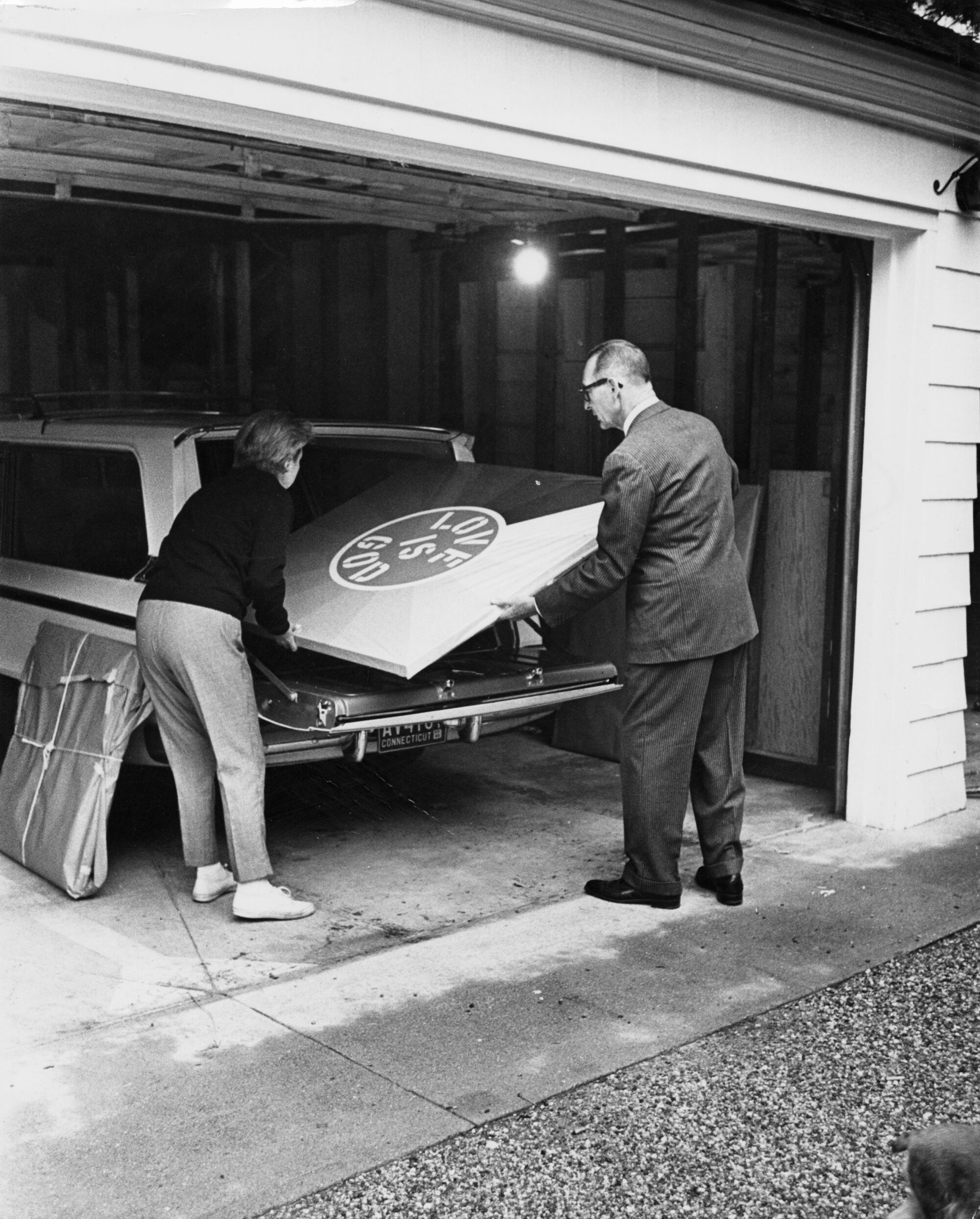
After his time in art schools, he moved to New York City where he met Larry Aldrich in 1964 at none other than The Factory, Andy Warhol's 47th Street studio.
At The Factory, Indiana approached Larry, he had heard of The Aldrich's opening and wanted Larry to commission a work of his. Before the Museum was even open, Indiana knew it was something he wanted to be a part of. He had a plan to create a unique piece for Larry based on the "Old Hundred's" history as a Christian Science Church, and also as a testament to his experiences as a youth. The typical style of Christian Science churches is prim and pure, with little to no decorative elements. The only consistent decoration in the churches is a gold inscription over the platform where the readers perform the service. This inscription reads, "God Is Love." Indiana had a different idea in mind and reversed the wording to read, "Love Is God."
As explained by Bradford R. Collins in Pop Art, the image had two inspirations. The first, a 1964 commission by art collector Larry Aldrich who was turning an abandoned Christian Science church into a museum.
In a letter to Aldrich, he wrote, "The LOVE paintings sprang like a crop from that seed planted at your museum, Larry, and the painting you commissioned, Love is God, which burst into mind when I learned that you were converting an old Christian Science Church in Ridgefield . . . for I, as a child, was raised as a Christian Scientist, and the word LOVE was indelibly imprinted in the mind, for there is that slightly different phrase, 'God is Love', on every front wall of every one of Mary Baker Eddy's houses throughout the world."

Robert Indiana, Love Is God, 2014, (50/50) Silkscreen on 2ply Rising Museum Board 32 x 32 in (81.28 x 81.28 cm) Framed 47.5 x 47.5 in Printer: Gary Lichtenstein Editions Available at West Chelsea Contemporary
This limited edition 'Love is God' Indiana print was made in collaboration with master screen-printer Gary Lichtenstein Editions.
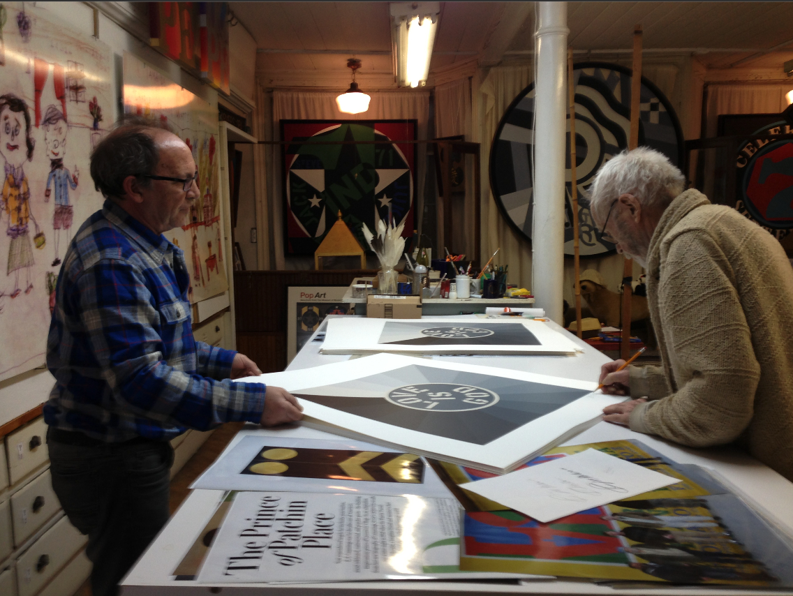
Gary Lichtenstein (left), Robert Indiana signing "Love is God" (right)
The Quiet Origin Story
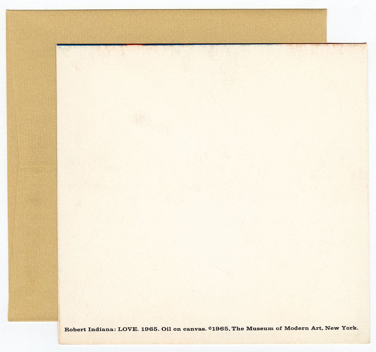
Perhaps the most beautiful part of LOVE's story is that it began as a Christmas card for the Museum of Modern Art in 1965.
Not as a grand artistic statement or a commercial campaign.
And somehow, that warmth never left the work — even as it became one of the most recognized images in modern art.
The Power of Simplicity Done Well
When Indiana created the stacked LOVE composition in the mid-1960s, Pop Art was often loud and deeply tied to commercial imagery. His approach was different. It was quieter and, in many ways, more earnest.
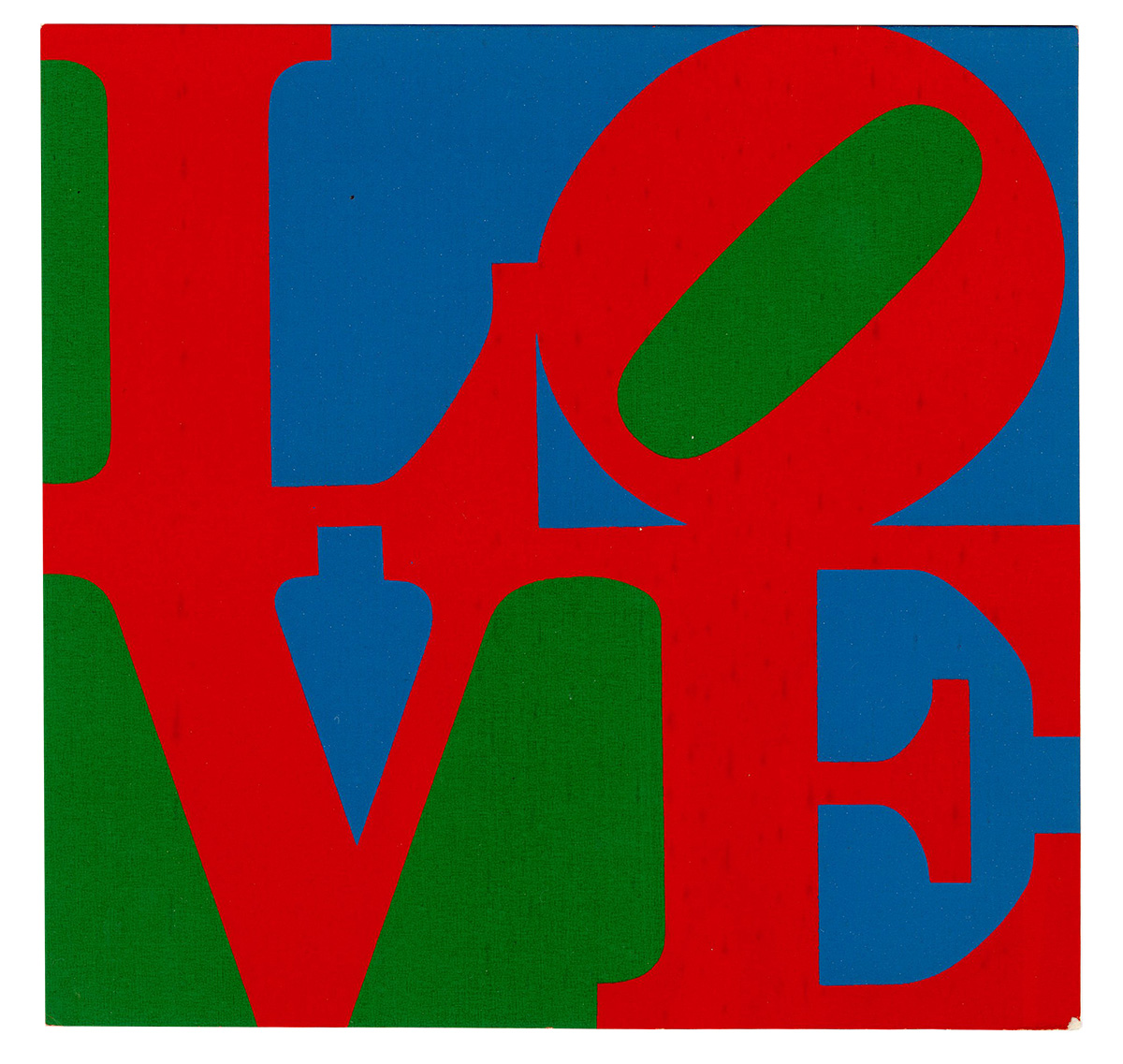
Four letters stacked in a square. A single tilted "O." Saturated, declarative color.
In choosing the word "love," Indiana felt "it could simply be a really universal painting." The design started as a Christmas card Indiana sent to friends—including MoMA curator Dorothy Miller, who subsequently commissioned Indiana to create one for the Museum (which produced and sold Christmas cards as a fundraiser at the time). Indiana translated Love into three-dimensional sculptures, paintings, and even jewelry.
When asked about his decision to tilt the "O", Indiana remarked that it just made sense. For he wasn't just expressing an idea in a spoken, written, read language. He was expressing the weight and merit behind the system of meaning.
There is nothing unnecessary in the composition. It feels architectural — balanced, grounded, immovable. You can read it from across a room, and yet it holds up under scrutiny. You can spot it from two blocks away and rush toward it for its familiarity.
The brilliance of LOVE is not simply what it says. It is how confidently it is built.
Indiana believed that language could function as visual poetry. He believed emotion deserved strong design. That belief — that restraint amplifies meaning — is precisely why the image has never felt dated.
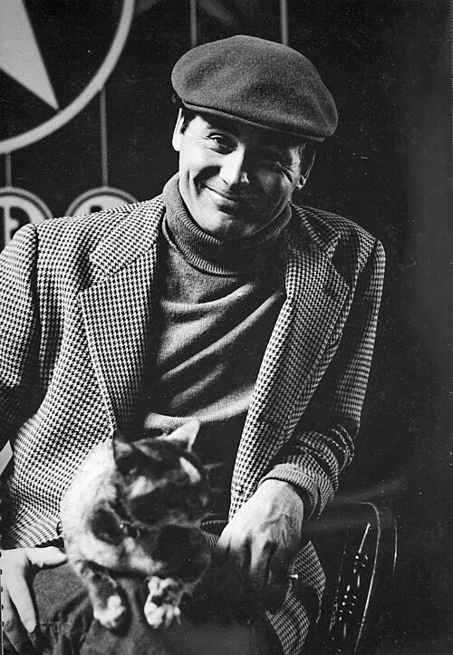
Robert Indiana. Photo by Dennis Griggs
A Private Influence That Shaped a Public Icon
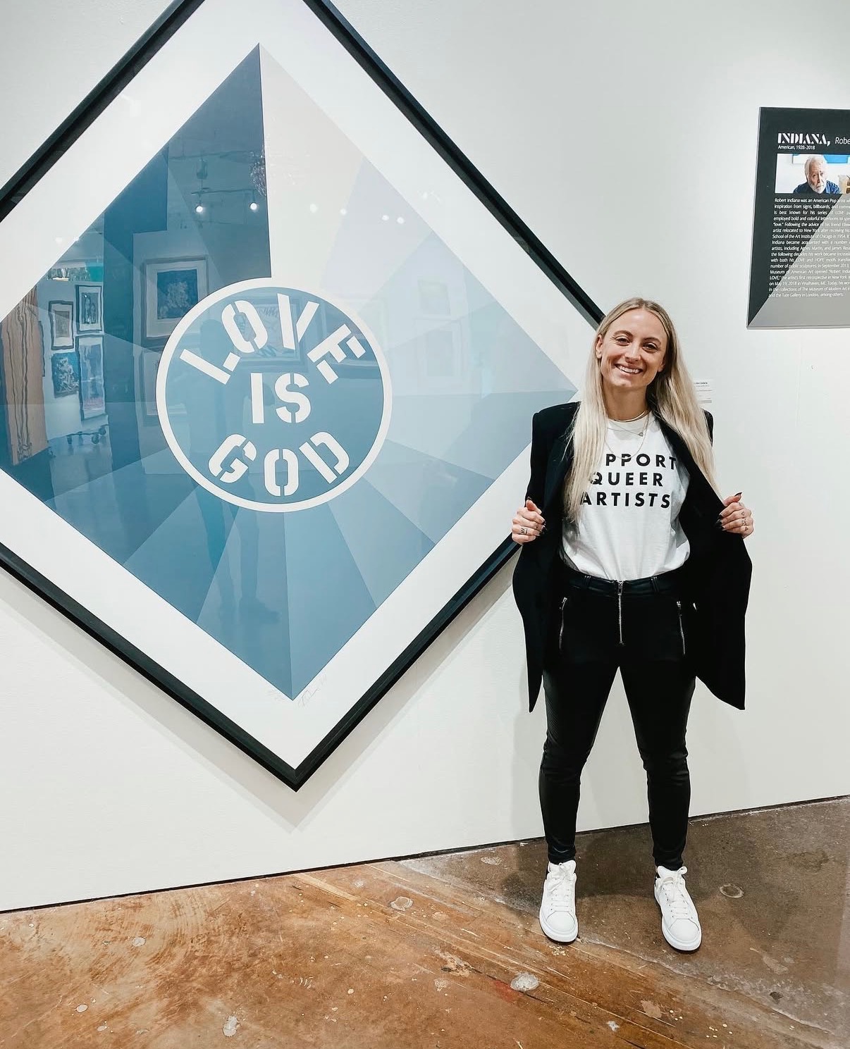
Installation view of "Love is God" in the gallery with one of my favorite shirts, 2021.
Another influence, often discussed more quietly, was Indiana's relationship with Ellsworth Kelly.
In 1956, Kelly walked into the art supply store where Indiana was working. They soon became partners and lived together for several years. Indiana later said, "Painting life began with Ellsworth… before him I was aesthetically at sea."
Kelly's work was rooted in pure form — bold color, clean edges, reduction to essentials. He stripped painting down to clarity.
Indiana absorbed that discipline.
You can feel Kelly's influence in LOVE: the precision, the control of negative space, the confidence to let color do the work. Indiana did not pursue abstraction, but he applied its lessons to language.
The word became the form.
And perhaps most importantly, the partnership itself — their shared devotion, their eventual separation — left behind one of the most enduring images of love in modern art history. It is impossible not to see that emotional undercurrent in the work.
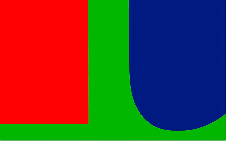
Ellsworth Kelley, Red Blue Green, 1963.
Perhaps one of the most overlooked queer artists from Pop Art history, Robert Indiana's partnership with color-field master Ellsworth Kelly breathed into being the iconic LOVE suite.
Often veiled in poems published beside the world-renown LOVE imagery, Indiana was forever changed by their shared adoration. Even after their separation, what emerged was some of the most memorable art of the 20th century. Inspired by, in homage to, love.
"My love, my love is gone to you Like two faces that cannot but turn Into each other warm and fierce Whose lips are mated flowers. The long petals growing Knowing search for their suns, Believing." - Robert Indiana | My Love, My Love is Gone To You (1996)
When Contemporary Art Entered Everyday Life
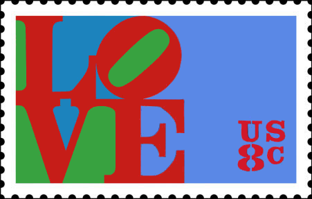
Robert Indiana Art director: Stevan Dohanos First day of issue: January 26, 1973
In 1973, LOVE left the museum and entered American mailboxes.
The U.S. Postal Service commissioned Indiana to adapt the image — originally created for a 1965 holiday card for the Museum of Modern Art — into an 8-cent stamp. It was released in Philadelphia, the "City of Brotherly Love," just before Valentine's Day.
Officially titled A Special Stamp for Someone Special, it became an instant phenomenon.
The Postal Service received floods of complimentary letters. When postage increased to ten cents, people asked for it to be reissued. Not everyone adored it — one critic dubbed it the "Hippie Stamp" — but it was impossible to ignore.
For the first time, millions of Americans interacted with contemporary art in their daily lives.
It traveled across the country inside handwritten letters. It became part of relationships, celebrations, and ordinary moments.
This shift was radical in the best way.
It blurred the boundary between fine art and design — something we now take for granted in our visually driven world.
Indiana helped pave the way for the design-forward culture we live in today.
Why LOVE Feels So Current in 2026
We are living in an era obsessed with clarity.
Minimal interiors. Bold typography. Intentional branding. Emotion communicated through reduction.
From fashion houses to tech startups to architectural design, contemporary aesthetics prize simplicity and impact — the very principles Indiana employed decades ago.
LOVE feels current because it already speaks the language of modern design. It could exist seamlessly in a gallery, a luxury apartment, a design magazine, or a social media feed.
Much of what we now call "timeless design" echoes what Indiana understood in the 1960s: clarity is powerful. Restraint is elegant. A single word, executed perfectly, can carry extraordinary weight.
The difference is that Indiana did it with unmistakable sincerity.
Indiana continued expanding LOVE beyond prints — into sculpture and monumental textiles that allowed the word to inhabit physical space.
In works like Chosen Love, the familiar composition becomes immersive. The word transforms into something architectural, something that shapes a room rather than simply decorating it.
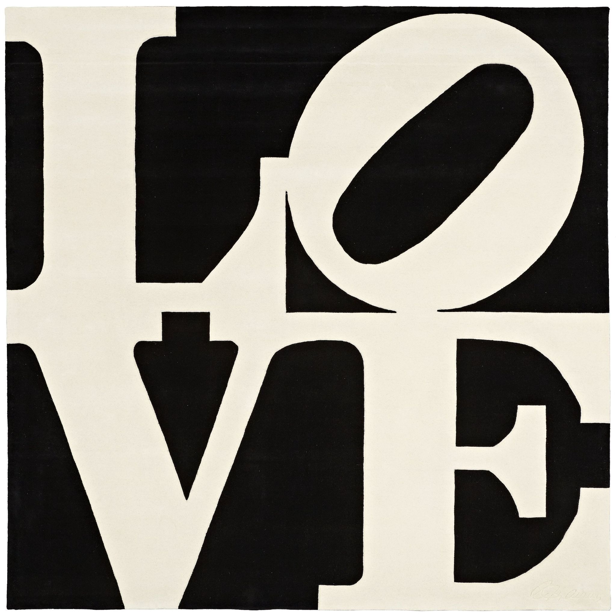
Robert Indiana, Chosen Love, 1995, (87/125) Skein dyed, hand carved and hand tufted archival New Zealand wool on stretched canvas 119 x 120 in (302.26 x 304.8 cm) Publisher: Master Contemporary Artist Rugs, New York, pub. Available at West Chelsea Contemporary
This feels especially aligned with how we experience art today — as environment, as lifestyle, as presence.
Indiana was already thinking this way decades before experiential design became a buzzword.
Why It Endures
LOVE still matters because it sits at the intersection of everything we value today:
design + emotion
clarity + meaning
art + daily life
It is visually strong enough for museums, emotionally open enough for everyone, and formally perfect enough to feel forever current.
In a world that constantly refreshes trends, Indiana created something beyond trend.
He created a symbol.
And symbols — when done well — don't age. They evolve with us.
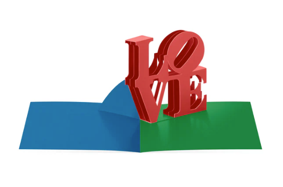
MoMA Exclusive: Robert Indiana LOVE Pop-Up Cards - Set of 8
And perhaps what makes LOVE feel even more alive is that it is not only a cultural symbol — it is still something you can live with, collect, and pass forward.
Works from Robert Indiana's iconic LOVE series continue to circulate thoughtfully on the market, including editions like The American LOVE from 1972 — the same visual language that transformed museums, mailboxes, and modern design itself.
There is something quietly powerful about owning a piece of an image that helped shape how we see emotion, typography, and contemporary art today.
Not a reproduction of a feeling. But the real thing.
For those curious, you can still acquire works from the LOVE series — including one currently available here — a reminder that history is not only something we study, but something we can live with every day.
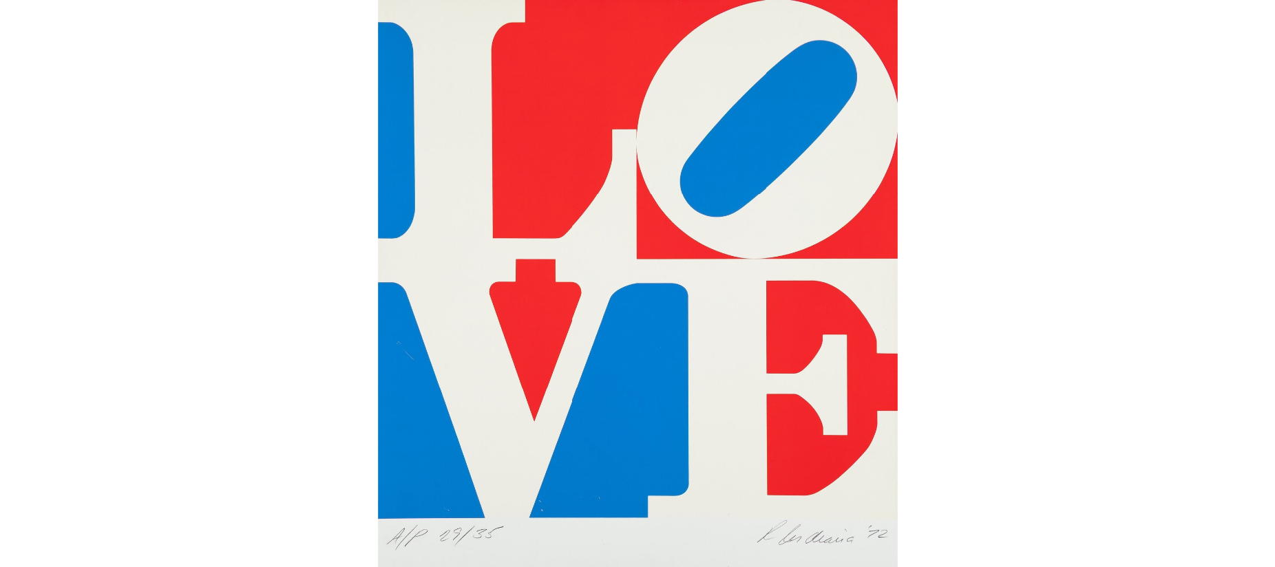
Robert Indiana,, The American LOVE, 1972, (AP 29/35) Screenprint in colors on wove paper 21 1/2 × 19 3/4 in | 54.6 × 50.2 cm Printed by Domberger KG, Stuttgart Available this week at Heritage Auctions
Footnotes: MoMA, Robert Indiana; The Story Behind Robert Indiana's LOVE at The Aldrich; Michael Bedwell for LGBTQ Nation.
